Thursday, September 30, 2010

fashion collection: Balenciaga Spring/Summer 2011

I like love ADORE AND OBSESS over Balenciaga’s Spring/Summer 2011 collection. Nicolas Ghesquière went back to his early designs and incorporated the classic biker-chick he's known for. From the leather, studs, trousers and houndstooth print, they were all there. In fact, Ghesquière has stated that he "borrowed from the music scene" and looked into different music stereotypes such as punks, goths, rockers and metal, all of whom are the more "hardcore" genres in the music world, very appropriate as inspiration for Balenciaga's hard-edge aesthetics. 
The color palette of the collection overall was very dark, to my liking. A lot of blacks and greys with a few bold colors such as cobalt and scarlet to pop things up. silhouette wise, the pants in the show aren't as skinny as they usually are, (remember Spring/Summer 2010 trousers that were probably only wearable by the thinnest of thinnest fashionistas?) The pants are in fact very loose trousers that probably referenced back to his band references.
Casting wise, Ghesquière casted in a mix of relatively unknowns, the usual Balenciaga girls, as well as a few supermodels you may recognize. He apparently took straight to the streets to find some of his models, saying that this collection was about everyone's individuality, hence the short crops on a few of the models. I have to admit, I've never seen the show's opener before, very rare for Balenciaga to let a new girl (and I don't mean Mirte Maas new like last season) I mean, VERY new. But I think she (her name is Milou van Grousen, obviously a Dutch) fits the Balenciaga mold very well. BUT I am quite very disappointed that other Balenciaga regulars didn't make it. I'm talking about Magdalena, Sigrid, Edita, Siri, Iris and Hanne.... well anyway, HIT LE JUMP TO SEE THE REST OF THE AMAZING/FABULOUS/COVETED COLLECTION!!!!!!


Tuesday, September 28, 2010

magazine (mini) haul: September 28, 2010

Hey guys to start off today was a very productive day for me, blogging-wise. Had my class cancelled so spent the whole of noon working and working non-stop on the few posts you see below this one. Now I'm feeling satisfied with what I've written so far and hopefully if you guys like what you see and read, I'll continue with my own personal rants about the happenings in the fashion world!
Well, I realized the few new posts I've made have all been very non-fashion communication wise but an analysis on the latest trends and collection. This was due mainly because of my class assignment to do so, but I do enjoy occasionally spotting trends and eye what's going on during fashion week. But I started this blog to focus more on the editorial and communication side of fashion! So today went to my local magazine stand to see what's hot of the printing press and found a few things that I've been waiting for to arrive. So as you can see from the picture above, I bought 4 magazines. 3 of which are new and 1 a second-hand one. See the whole thing AFTER LE JUMP.

spring/summer 2011 trends: White Minimalism

White has always been a neutral color that everyone should have in their wardrobe. You wear a basic white tee from Alexander Wang and you can match that with anything eccentric or bold, say... Dolce&Gabbana's leoprad print jeans or Balmain's pencil-thin leather trousers. The power that the color white brings to the outfit is that it balances out any crazy prints or patterns that add on to the outfit. This season I'm pleased to see that a lot of designers have focused their collections on this color, very appropriate for the season.
From left: Jil Sander's play with combinations, Calvin Klein's extreme volume, Versace's body conscious cuttings, Alexander Wang's ready-to-wear street style, Bottega Veneta's drastic fabric choices, Dolce&Gabbana's Sicilian romance.

Each designer approached this color in their own way and each one has created garments that are appropriate for everyone's style, age and body size. HIT LE JUMP TO SEE MORE.

Monday, September 27, 2010

fashion collection: Fendi Spring/Summer 2011

Initially I thought this Fendi collection was fairly arbitrary. The color scheme was everywhere, the pattern as well as the cutting; the only thing bringing it all together was the airy volumes. However, like every single Fendi runway collection I've seen, I needed time to appreciate and notice the small details that weave this collection together (their Spring/Summer 2010 collection is my favorite). It was the idea of summer, specifically a very Fendi summer holiday brought together through color and silhouette. Fendi is a house where their color scheme has always been bold and strong, just last season's bold, dusty hues have been replaced by bold and bright. Silhouette has also been a staple in the Fendi house and that this time they chose to play with big volumes to compliment the incoming summer holiday during 2011. 
Overall, the color scheme was very strong. Scarlet, turquoise and cobalt were all inlcuded in the pallet as well as an overweight of white (clearly going to be trend next season). Motives included pressed flowers and interestingly enough, burn marks printed on the dress. Perhaps a metaphor for the clear temperature increase in this planet? Maybe? Well whatever it is, I find the print rather fresh and I'd rock it. The fabric choices seems effortless and seems to just drape on the body so fluidly, but then structure is added through the belt which then shapes the body. We didn't see much of this last season, or even the season before in Fendi. CHECK OUT MORE AFTER LE JUMP.

fashion collection: Rodarte Spring/Summer 2011

What can I say? Rodarte has always been one of my most look-forward shows every fashion week. Good thing they show during New York fashion week because I don't think I can wait till the second, third or forth week! Well anyway, for their Spring/Summer 2011 collection, Kate & Laura found their inspiration direct from their childhood, specifically their backyard! How very typical of them, why just last season they drew inspiration from sleepwalkers and now their backyard, these sisters can find inspiration in almost everything they lay eyes on.  
 The color scheme of this collection was very earthy and neutral with a hint of blue as well as gold near the end. Though their silhouette consisted of primarily hourglass figures, it didn't feel constraint or restraint. They covered everything a summer wardrobe needed, dresses with cut-off shoulders, jackets cropped at the waist, blouses in wood-grain prints, pleated trousers and wrap skirts. Their signature collision of fabric as well as play in draping is still very apparent this this collection, however, I did sense that this time around, they've made their clothes more wearable ala Gareth Pugh for his Spring/Summer 2010 collection. Maybe its because LVMH is still considering purchasing a stake in their brand? Well whatever the reason is, they've made a collection very much under my envy of anyone who owns them. MORE CLOSE UP AFTER LE JUMP!

Friday, September 24, 2010

magazine collection: i-D Magazine

i-D Magazine was the first magazine I've every really truly started obsessing over. Primarily because I thought their covers were very exciting. The "wink" on every cover was simply iconic and my 16 year old mind thought it was cool that they featured that on every single cover. But that was years ago. Now I buy i-D magazine for their very fresh approach to fashion editorial and photography. Their cool covers are a plus. 

However, last year when I found out that i-D was going to start publishing every 2 months I was devastated because that meant only 6 issues per year! Fast forward to NOW and more or less use to it, but I still wonder as to what would have happened if I had 6 extra issues in my bookshelf now...
What is also nice to note about i-D is that they're not afraid to think outside the box editorial wise. With big photographers spanning from Emma Summerton, Inez & Vinoodh and more, each issue is always packed with excitement and I'm always giddy whenever I purchase the most recent issue. 
My four favorite covers from my vast collection of i-Ds.
June 2008 with Sasha Pivovarova
September 2008 with Jourdan Dunn
October 2008 with Natasha Poly
November 2008 with Lara Stone
*i-D was really on role with their covers for the Fall of 2008 for me! ahahaha

Just recently though, since the change in producing an issue every 2 months, each time they publish out, they provide us with an abundance of cover to choose from. This is both a blessing but annoying at the same time for me personally because most of the time I can't decide as to which cover I want, but I've never encountered a moment where I felt the need to buy two covers. Well anyway, see my entire collection after the JUMP!


magazine collection: Dazed & Confused

Dazed & Confused was actually one of the first magazines I've started collecting aside from i-D (review on that soon). What I love about Dazed is the art direction of their overall magazine. I would say that their layout is less conventional than most magazines you see on newsstands today. But, after they've re-invented the magazine as a whole since their April 2010 issue with the The XX on the cover, I actually found myself distancing from this. I don't know.. Maybe its how the layouts now (to me) looks more messy and the editorials so far seem very un-inspiring. But regardless, I still purchase every issue in hopes that they might get better as each issue is published. 


So as usual, these are my favorite issues from my collection. 
July 2009, #75 with Kendra Spears
October 2009, #78 with Guinever
December 2009, #80 with Abbey Lee
February 2010, #82 with Magdalena Frackowiak

I've always felt that Dazed's covers always stood out. The color treatment as well as styling wise, its more towards the edgier style of appealing to the masses. However, I am going to admit that the few recent covers have been slightly daft. But alas there's hope!. Haven't even gotten my September issue yet (Singapore is damn slow!) but I'm actually looking forward for their October cover with Kirsi Pyrhonen on the cover in Balenciaga! but god knows I'm probably going to get that in November -___- Anyway, see my whole collection after the JUMP!


Thursday, September 23, 2010

magazine collection: Vogue Italia

So after making a review on Vogue Nippon, I’m going to cover Vogue Italia. To many, Vogue Italia is THE fashion magazine. It pushes the boundary of fashion photography as well as challenges the public to very controversial and shocking images.  To be frank, if I had to decide which Vogue collection to save if say a fire were to run in my dormitory, I would save every single issue of my Vogue Italia.
Here are the basics:
Editor-in-Chief: Franca Sozzani
Firust issue: 1964

Every single cover and main editorial in Vogue Italia is shot by non other than Steven Meisel since the late 80’s. Here are my favorite covers from my collection, but as you can see from my second post in this blog, their October 2007 cover will forever be my favorite, too bad I can't find it :'(.

May 2007 with Gemma Ward
October 2008 with Anna Jagodzinska
December 2008 with Katrin Thronmann
June 2009 with Meghan Collison

Meisel's editorial tends to either push the boundaries of fashion and becomes instantly adored, or it can be a classic (often dull) studio shoots. Some issues he's touched on for editorials include celebrity rehab, oil spill in the Mexican Gulf, terrorism attack of 9/11 and the list goes on... 
He's known for having a circle of favorite models he feature in each cover, American Vogue even dubbed him the "godfather" of all famous models today which includes Giselle, Naomi, Linda and Christy. I'll do a post about his personal life soon! But for now, to see my Vogue Italia collection, continue after the JUMP!


magazine collection: Vogue Nippon 10th Anniversary Issue

I'm actually unaware as to how rare and valuable this issue is, but I was lucky enough to stumble upon it at my local magazine stand. Behold my Vogue Nippon 10th Anniversary Issue! Its huge, bigger than a V magazine and quiet heavy too. Since it's a collector's item maybe its best to not carry it around anyway. The foreground is gold in color with the number 10 in holographic, and not those cheap holographic, this one is absolutely gorgeous. 
Content wise, it's filled with the history of Vogue Nippon as well as Japanese fashion. There are special editorial and spread celebrating their anniversary too. Took a few snaps of the contents but not everything! Sorry.
Continue after the JUMP!


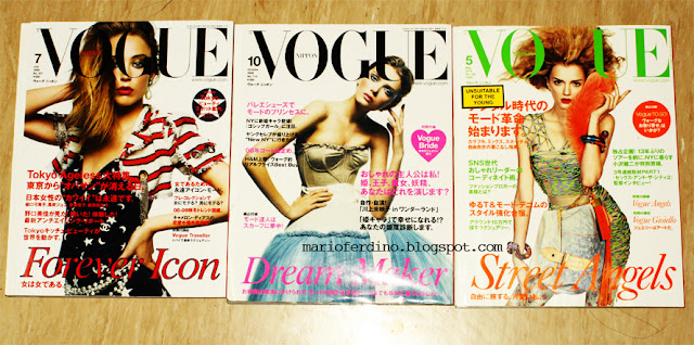
magazine collection: Vogue Nippon

Well this is going to be my first review of an edition of Vogue. I decided to start this review with Vogue Nippon because I just did a post on their November 2010 issue. To start things off, here’s a little background information on them:
Editor in Chief: Kazuhiro Saito
First issue: September 1999

What strikes out about Vogue Nippon are their covers. Very simple white background, one model (with the exception of their 2007 issue with Coco Rocha and Sasha Pivovarova), one straight-of-the-runway outfit. A masthead is featured to tell the readers what the theme of the issue is about.

Here are my favorite issues
August 2008 with Raquel Zimmermann wearing Chanel
October 2008 with Lily Donaldson wearing Dolce&Gabbana
May 2010 with Lily Donaldson wearing Louis Vuitton

Continue after the JUMP!


magazine haul: September 22, 2010

So yesterday my friends and I took a trip down to Orchard for a well-needed quality time together. I decided I needed to stock up on magazines for I haven't bought a single one in weeks! Been too lazy to get myself to travel all the way down town as well as being broke. But anyway, went down to the Kinokuniya at Ngee Ann City and got these:
Didn't find much, I was mostly looking forward to buying the September issue of Vogue China, but to my shock they said they're out and might restock at the end of the month. OH GOD THEY BETTER. But anyway, bought 6 magazines.


Wednesday, September 22, 2010

Vogue Nippon November 2010: Lily Donaldson by Inez and Vinoodh

It may still be September, but Vogue Nippon has already released their November issue, one month in advance as usual. I actually still don't understand why they release their magazines a month earlier, but I'm not complaining about it. Cover model Lily Donaldson is seen here wearing yet another Miu Miu look from their Fall/Winter 2010 collection. This is in fact Lily's 2nd Vogue Nippon cover this year, the first one being in May (my favorite Nippon cover). The color scheme is overall quite coherent, The black and orange texts as well as the earrings all adhere to the harmony of the cover. It's interesting to note that as compared to the other Nippon covers this year, this one is shot only from the waist up. I must say though, I quite miss the old headline font they use to have up until their August 2010 issue. But it's not too bad, maybe I need some time to get use to it.... 
However, I can't say I'm too thrilled with the outfit choice, but I absolutely adore this Miu Miu collection and say that at least they didn't go with the obvious choice dress used in British (Freja, August), Australian (Codie Young, October) editions of Vogue, Elle UK (Lily Allen, August) and W (Eva Mendes, August). They in fact went with one of the more simple designs from the collection.
I will do a review on this as soon as I get my copy.


Click to see the dress as well as a comparison!


my magazine collection part UNO

So I've decided that since I'm going to discuss a majority of this blog on the communication side of fashion, and I've stated in my previous post that I'm obsessed with fashion editorials; I'm going to post my growing and humble collection of magazines. Keep in mind that this is part one of my collection. I'm currently only going to feature my Vogue collection, because when one thinks about fashion magazines, Vogue always sticks out as the leading magazine in fashion. 


To be frank, I've only started collecting about a year and a half ago. Ever since I moved to Singapore about a year ago I started investing (yes, I consider it an investment) on a lot of fashion magazines. A majority of it being Vogue of course. As you can see from this image here, I collect a lot of different international versions of Vogue, with American Vogue being the most. If you were to ask me which one is my favorite, I wouldn't be able to give you an answer. Each edition is unique in its own way. Italia gives me inspiration and plays with how far my imagination can go. Paris give me glamour and luxury. Nippon gives me clear, fun art direction as well as keeps me from forgetting my Japanese fluency... and it goes on. 

I will do a more in depth review on each edition of Vogue soon.
  
See close up shots after the jump!