
What can I say? Rodarte has always been one of my most look-forward shows every fashion week. Good thing they show during New York fashion week because I don't think I can wait till the second, third or forth week! Well anyway, for their Spring/Summer 2011 collection, Kate & Laura found their inspiration direct from their childhood, specifically their backyard! How very typical of them, why just last season they drew inspiration from sleepwalkers and now their backyard, these sisters can find inspiration in almost everything they lay eyes on.

The color scheme of this collection was very earthy and neutral with a hint of blue as well as gold near the end. Though their silhouette consisted of primarily hourglass figures, it didn't feel constraint or restraint. They covered everything a summer wardrobe needed, dresses with cut-off shoulders, jackets cropped at the waist, blouses in wood-grain prints, pleated trousers and wrap skirts. Their signature collision of fabric as well as play in draping is still very apparent this this collection, however, I did sense that this time around, they've made their clothes more wearable ala Gareth Pugh for his Spring/Summer 2010 collection. Maybe its because LVMH is still considering purchasing a stake in their brand? Well whatever the reason is, they've made a collection very much under my envy of anyone who owns them. MORE CLOSE UP AFTER LE JUMP!

Here are the close-up shots of the four garments (my favorite ones) from the collection. The opening number featured a check buttoned up shirt in a very dusty purple with cut out shoulders. I would die to have this shirt! The color as well as the cut out is very suitable for the very very hot Singapore weather.
The second close up, worn by Kasia Struss had an interesting hierarchy in color. The dark brown wrap-skirt at the bottom, the light airy blouse on top, overlapped by a corset piece that seems to merge both contrasting elements together. I find this combination to be rather difficult to achieve, but it seems Kate & Laura made an effortless try to do so.

The third close up shot features a stunning stitching of what seems to be hydrangeas in white and blue over a sheer fabric. This dress then goes down to show an array of gorgeous flower designs in both blue and white as well. The overall color scheme reminds you of those old day china pots does it now?
The last detail shot is of the dress with the wooden tiles printed on. What I found very striking an unique about this dress was the geometric shape present on the chest are. It seems to draw your eyes in, and the how much detail they put into the realization of the wood tiles is simple amazing. The overall gradating tone of the garment is also something to note.

I noticed this dress may seem a combination of the two dresses from above. It seems to be a collateral of the embroider from the blue dress but through the color scheme of the brown one.

This brown dress worn by Rasa (last season's Prada's only-girl campaign star, duh) has wooden tiles that nostalgically reminded me of my very own childhood. The carving and the details reminisces the time when I use to visit my families who live in the country side and they homes are covered in this motive. The variety tones of brown used in this dress meshed perfectly with one another and the line as well as the checks compliment the overall silhouette of the dress.

What i liked about this looks was the feature of a blazer. But in Rodarte fashion, they printed it in checks that reminded me of Indonesian batik, as well as the cut off shoulders. The hierarchy in color is also something I noticed and that the overall shade of the outfit is very light as compared to the rest.

Probably my favorite look out of the whole collection, I'm a sucker for structures dresses. Worn here by Givenchy favorite Antonella Graef, the dress is in overlay of a brown and gold pleated waisted skirt topped by a gladiator-esque embroided dress. The skirt is cut in a way that reveals the skirt underneath, thus revealing hints of a darker color.

The finally dress worn by Anja Rubik would have to be my least favorite look from the collection. I feel that the overall structure, form and silhouette is very unflattering. Especially for Anja who is known to be one of the thinest models this day, the dress makes her look quiet big. Possibly caused by the skirt of the dress, the material seems to be puffing out a much bigger volume than anticipated. However, I'm completely hypnotized by the color. It's very rare I see a dark golden/copper color used in an evening wear. This might have worked better if they'd had tighten the silhouette a bit more maybe?
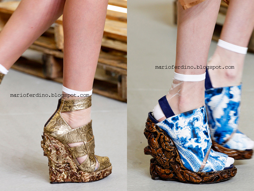
Last but not least, we can't forget shoes! Rodarte is known for producing some of the most detailed and intricate shoes on the runway. Who can forget those spiked Christian Louboutins? Well this time they've made wedges with carved flowers and leaves in them. The carving seems very traditional, like something I would see in a museum in Indonesia, but it's contrasted by the modern prints used on covers. The height of the shoes is just right for my taste but overall, as much as I enjoy the design, it doesn't do much for me. Maybe its the fact that I'm not that attracted towards wedges? I don't know. But it does seem appropriate for the season though and that's what matters.
Source: style.com
No comments:
Post a Comment