Tuesday, November 9, 2010

fashion collection: Louis Vuitton Spring/Summer 2008

So without much things to review on recently, I've decided to make a post on my ALL-TIME-FAVORITE FASHION COLLECTION. Louis Vuitton Spring/Summer 2008 is by far, the most exciting fashion collection I've laid my eyes on. When I first started off investigating on fashion when I was younger, I found this specific collection on style.com and thought it was very weird why such a prestige and classic brand would do a collection that is so jumbled and crazy. But that's the beauty of Marc Jacobs designs. As ya'll should know (if you don't, shame!) this collection was a collaboration between Mr. Jacobs and artist Richard Prince. You guys may have seen Richard Prince's series on nurses as well as his "After Dark" series. Well, those components became the main inspiration for the overall collection, as well as taking the color scheme from Spongebob Squarepants. How random is that right? So random that I love it. Well, everything, from coats, dresses, suits and bags, nothing was kept to the ordinary. Jackets were completely exposed in the back, bags are done in a spectrum of acid colors, suits were done in varying fabric choices, overall creating a very muddled collection, that worked. An organized chaos. 
The opening of the show featured 12 leading old-school supermodels, all dressed up as Richard Prince's nurses, complete with Louis Vuitton lace mask and nurse caps. From left: Stephanie Seymour, Eva Herzigova, Rianne Ten Haken, Anne Vyalitsyna, Carmen Kass, Natalia Vodianova, Angela Lindvall, Isabeli Fontana, Karolina Kurkova, Lara Stone, Nadja Auermann and Naomi Campbell. SEE THE MASSIVE COLLECTION AFTER LE JUMP!

Friday, November 5, 2010

magazine haul: November 6, 2010

Hey guys, this is going to be a short post about my haul from today. Firstly, happy Diwali! Since today was a holiday, I decided to go hang out at Orchard since I haven't gone there in the longest time, plus i needed to go to Kinokuniya for my magazines. Let me tell you, Orchard today was very packed with tourists and locals alike. The Kinokuniya wasn't any different, but alas, I had to persevere forward and got the magazines I needed. 
Overhead shot of my purchases, with Natasha Poly's French Vogue cover on top. Bought mostly december issues of the magazines, bringing in a close to a year's worth of collection. Though I'm not really feeling the cover, I'm quite disappointed that Natasha didn't get an accompanying editorial in this issue. But whatever..... SEE MY WHOLE PURCHASES AFTER LE JUMP. 

Saturday, October 9, 2010

magazine collection: V Magazine & VMAN

V Magazine, launched in 1999 features a mix of fashion, art, film and music. Published 6 times yearly, it's become one of my must-buy magazine besides Vogue. Primarily what I love and think stands out about V Magazine are their editorials and their fresh unique and risque photo spreads. Their covers are also something to marvel at; featuring prominent supermodels and relevant celebrities.
However, frankly speaking, I can't say the same about VMAN. Though I do purchase every issue that comes out, I solemnly do it for the eye candy that's ever so present in the pages. I find their photoshoots repetitive, un-inspiring, but hot. Give me any publication with half-naked guys and I'll buy it in a heartbeat. 
My favorite V magazines.
V58 Spring 2009 with Natalia Vodianova and an actor (it's their glow-in-the-dark cover)
V59 Summer 2009 with Naomi Campbell
V66 Fall Preview 2010 with Natasha Poly

Also something to note about V Magazine, much like other publications on the edgier side of styling, they feature recognizable designer clothes but style them in the most unique ways. Whether they're placed inside-out, stretched or shrined, all just truly inspiring stuff. Well, see LE JUMP to see my whole collection!


Friday, October 8, 2010

magazine collection: Vogue Paris

I've been a feeling a little guilt since I've been neglecting writing a post about my magazine collection, so today would be the day I do one on my Vogue Paris collection! I've always thought of Vogue Paris as the more classic and luxurious of the Vogue editions. With their select group of current supermodels and clothes which reflect the chic-parisian style, each edition brings in a new interpretation of what beauty is. Their current editor-in-chief, Carine Roitfeld has been at the helm of the magazine since 2001, and has brought in a mix of celebrities and models into the publication. 
(Sorry for the slight blurry images)
November 2007 with Carolyn Murphy and Andre
June/July 2009 with Anja Rubik
April 2010 with Natasha Poly
February 2010 with Daria Werbowy

A lot of their shoots are either done in a studio, or taken to exotic places, with a mix of controversy thrown in. From Lara's now-notorious blackface editorial, to an all-star cast of actresses promoting breast-cancer awareness, the inspiration and concepts are never ending for them. See my whole collection after LE JUMP.

Thursday, October 7, 2010

fashion show: Chanel Spring/Summer 2011


I'm actually speechless. I'm on such a fashion-high right now. Just when I thought last season's iceberg show was insane and mind-blowing, Karl manages to prove me wrong. At first when I did my Chanel review I didn't think much for the collection, just another one of Karl's practice and re-interpretation with Coco Chanel's house codes. I didn't care for the setting for I judged by the pictures alone that it looked quite generic. However, after watching the actual fashion show, I've changed my mind. This is probably the best fashion show I've seen in my life. From the setting, the soundtrack and the choreography, I was actually moved; though some of the models did look a little confused over the directions, especially during the last few looks, but I find myself liking this part of the show the most. I especially loved the part when Heidi and Sasha had to slow down and cautiously take baby steps so they won't go too fast, and you see Coco on the other side doing the same thing. (this happens in part 2)
The opening, with Stella and Freja was also amazing. The way both entered and moved at the same exact pace followed by the sounds of the orchestra and you see the overall shot of the whole Grand Palais... I'm just speechless. If you're too lazy to watch the whole thing, at least watch the first minute and a half of the show. Seriously.
See part 2 of the video AFTER LE JUMP.


magazine collection: Vogue Italia September 2010

So here's my post on the massive Vogue Italia I just got today. Basically what's special about this September issue is the 3-D factor of their photoshoot. Meisel's story with Miranda would've been an ordinary studio shoot if it weren't for the 3-D effects. 
 Basically when I found it at Kinokuniya, it was in a huge package and came with FIVE supplements. more on that AFTER LE JUMP.

magazine haul: October 7, 2010

So after school today I decided to make a round trip through town to check Kinokuniya out. I was in desperate need for the September issue of Vogue Italia, and today I had a feeling it was going to be in stock. Unbelievably I was right! With only one copy on the shelve I felt very lucky, but what I didn't realize was how big the package was going to be! (will do a separate post on it!) The whole time I was just smiling and giddy because I also got my copy of the 90th anniversary issue of Vogue Paris! I made the right choice of going today :).
So this a small pile of my purhcases. Only bought a few, since I bought a lot less than a week ago! I'm spending so much money on magazine, but what can I say, I'm addicted! Now the only magazine left on my to-buy list is the September issue of Vogue China, but at this point I'm pretty much sure it's gone. But oh well, no big deal. If I didn't get this issue of Vogue Italia I would die. CLICK LE JUMP TO SEE EVERYTHING.

fashion collection: Louis Vuitton Spring/Summer 2011

Marc Jacob's latest collection for Louis Vuitton was a mix of Art Deco, Art Noveau, orientalism and animal prints. Basically everything I learnt from textiles class last year. Close were very reminisce of ancient Chinese uniform, through the sleeves, collar and cut. Applique were also very much reflective of the Art Deco movement, the small touches that made this collection very spectacular. Animal prints were also incorporated in the last half of the looks, with zebras and giraffes printed on every skirt, dress and tops. 
Color scheme was very vibrant and bright (like his own name-sake collection back in New York), a lot of fuchsia, turquoise and yellow in silk metallic hues. Nouveau prints were also adorned across some of the dresses with flowers and stems which brings even more of the oriental inspiration in. Overall I feel the mood of the collection is more youthful and daring as compared to last season's 50's inspired collection. Can't wait to see these next year! see more after LE JUMP.

Wednesday, October 6, 2010

fashion collection: Chanel Spring/Summer 2011

Initially I was going to do a review on the latest Chanel collection. However, after seeing the mammoth of a collection Karl has made, I had to re-think then decided on not doing it. There were simply too many looks and it would be too much trouble to try and sort it out one-by-one.  BUT NOW, I am finding any excuse to not do my school work at the moment, so I decided, since Chanel is one of the few BIG fashion houses today, might as well do a review on it. So here it is !
 I am however, not going to do much in-depth review, only going to point out main factors each look brings in to the collection, you guys can judge for yourselves. Basically the idea behind the collection was fairly similar with Karl’s Spring/Summer 2010 collection for Fendi; the idea of things being un-finished. As you can see from the jacket Stella (who opened) is wearing, Karl has directly cut out holes (GASP!) on them. As you will see from what I’ve gathered, a lot of the garments are undone at the hemming and edges are also fraying. The collection also featured two giant umbrellas (one being hold by Karlie above) and had a surprise model appearnce by this super duper cute 2 year old <3 How adorable is that tweed jacket on him? I’m in love. Too bad it’ll probably only going to fit him for a year or so then he’ll out-grow it. Well anyway… without any more fusses, CLICK LE JUMP TO SEE MOOOST OF THE LOOKS I'VE COMPLIED (ITS ALOT).


Candy Fall/Winter 2010: James Franco by Terry Richardson

Wow. Just... WOW. When I saw Candy's first issue with Luke Worral on the cover, I figured this was just going to be another gimmick publication. But I was wrong. For their second issue, they've managed to nab James Franco on the cover. But it's not ordinary cover, oh no. He's actually willing to turn himself in drag. AMAZING. Coming from an actor who's very versatile in his acting, I'm not that all surprised he actually took on the part. After his famous roles in Milk, Pineapple Express as well as Spiderman, his ability to transform himself into any role is obvious. 
I so-desperately want a copy of this just for the sake of having a transversal magazine. How cool right? The shoots from inside their first issue looked good and I know without a doubt this issue is very promising. Well this cover is shot by none other than Terry Richardson and though the eye make-up is slightly un-flattering on Franco, he fits the part of a drag very very very very well. Bless him. See another photo after LE JUMP. 

Monday, October 4, 2010

fashion collection: Yves Saint Laurent Spring/Summer 2011

Stefano Pilati's latest collection for Yves Saint Laurent's was a more modern update to the classic pieces Saint Laurent was known for. From trenchcoats, blouses and the Le Smoking, all were interpreted to the 21st century through Pilati's vision. A mix of color, texture and ruffles were all added to the heady mix of a magnifixent, minimalist collection. The classic code that Yves Saint Laurent is known for is still very much present in the collection, just maybe more extroverted. 
I did notice that a big majority of these looks were very night-wear looks, though some are definitely looks meant for day-wear. With belted waists and some very light-weight, free-flowing fabrics, the classic Spring/Summer feel is achieved. However, I did notice a certain fabric in the collection that I feel may be a little out of place from collection; more on that AFTER LE JUMP. 

British Vogue November 2010: Lara Stone by Alasdair McLellan

Well guys, here's the November cover for British Vogue. Unxepectedly, Lara Stone got the cover while rumors had it that Rosie Huntington Whiteley was going to get it, but hey, I'll take Lara over Rosie anyday. This is actually her second British Vogue cover, her first one being in December of last year. It's great to see them style Lara in a more serene and softer fashion as compared to what Vogue Paris or Italia would do. The signature Lara elements are almost all present, her gap, her bleached brows, doe-eyed stare, except for her notorious boobs; they've decided to cover them completely which I think is a good and appropriate idea that made this cover worked.  
Lara has just recently became more mainstream. With her W cover for August of last year, I already had a sense that she's slowly gaining momentum. Then afterwards, scoring the December issue of British Vogue (her Vogue cover counts totaled up to around 6 last year!) I knew her public image was going to explode into the public eyes. I'm just so happy for her now. Having known her history in the fashion world (started working at the age of 16, now 27) she's come a long way. From her stints at rehab to the controversy with her weight, she's had to deal with so much. But now that's she's settled down with a new husband just earlier this year, things seems to have calmed down a bit for Lara.
Lara Stone-aside, to be honest I actually have no idea what she's wearing on the cover... but the pose, red font and placement of words reminded me so much of Jessica Stam's August 2007 cover. SEE THAT COVER AFTER LE JUMP. 

blesssssss her < 3

Bet you've never seen the devil act this way.

Anna Wintour caught in a very awkward pose during the Nina Ricci show. Wonder what caused her to do this?

source: dailyfrontrow

fashion collection: Givenchy Spring/Summer 2011

Riccardo Tisci's vision for Givenchy is slowly turning away from his usual gothic, Catholic influences and are absorbing different forms of inspirations. Last season we saw Tisci experimenting with prints (Christmas ones to be exact), this season he does the same, but with leopard. And how about last season's heavily structured coats? replaced by sheer fabrics draped over the body. I personaly adore the layering and colors done in the collection. The leopard print is also very define. I find his interpretation of the classical pattern fresh, focusing more on the dark lines, instead of say what Cavalli or Gabbana would do with it. 
The color palette for the collection is very basic. Black, white and a hint of cream, but with lots and lots of leopard print. Whether it's cleverly embossed on leather or printed faintly on the organza, it's everywhere. Model choice wise, Tisci choose to go with a few new faces. Natasha Poly made her first (as far as I know) appearance on the runway in Paris. Tisci's transgender assistant, Lea. T also joined the line up to my surprise, and it's great that Tisci's involving every type of woman from race, age and even gender into his shows. Kudos. SEE MORE AFTER LE JUMP. 

Sunday, October 3, 2010

fashion collection: Viktor & Rolf Spring/Summer 2011

Viktor & Rolf has once again presented another collection that I could only imagine. In fact, I wouldn't even dream of concocting such an exciting and visionary collection. The main inspiration for the collection came from "to riff on a man's shirt", though it's interesting to see such an easy and basic idea interpreted in a much more extravagant scale.  Outfits included dresses with four sets of collars and cuffs, shirtdresses that were fitted onto one side, while the other dangles softly like a very loose dress. These idea came together to form a collection that is truly only possibly done by Viktor & Rolf.
The color palette for the collection included blues, reds and basic black & white. The blue and red fabrics used were done in strips of ribbons in an array of respective shades. The two classing colors almost brought in an elements reference to me, the idea of fire VS water. Bu that's only seen if garments are placed side by side. The white and black dresses were very formally done, appropriate for any special events but only if you wish to dress more daring and stand out. It's no doubt the Viktor & Rolf wearer has a lot of confidence and isn't afraid to get a few stares from on-lookers. SEE THE WHOLE COLLECTION AFTER LE JUMP.

magazine haul: October 3, 2010

Ok, well here's the thing. I know I've stated that the sole purpose of starting this blog (aside as a school project), was to discuss the communication and editorial side of fashion. I know with my last few posts I haven't really done that, instead focusing on recent Spring/Summer 2011 collections. But I do realize that reviewing recent collections is actually a lot of fun! Plus it keeps me in the know of what's going on design wise. But today, a friend and finally got out of our place and went to Orchard for a well needed spree over at Kinokuniya! Then afterwards went to my local magazine stand to look for the September issue of Vogue Italia (way overdue) but sadly it's still not out in this part of the world yet.....
So here is the pile of my purchases today. Bought a few miscellaneous magazines primarily for their covers but most are for my collection. I actually think I O.D-ed and bought a little too much, but I figured I will buy it eventually so why not buy it then? Well I'm still on the look-out for the September issue of Vogue Italia, and for the new I-D magazine. It was already out at Kinokuniya, but my local magazine stand sells it for relatively cheaper, but sadly they didn't have it stocked yet. So I'm still deciding whether to wait or not.... I'm set on buying the Lindsey Wixson cover cause it looks fresh and I already have 32043209 magazine covers with Kristen McMenamy (Ok around 3, but that's still a lot). SEE DETAILS AFTER LE JUMP! 

Friday, October 1, 2010

fashion collection: Isabel Marant Spring/Summer 2011

Isabel Marant has stated that her Spring/Summer 2011 collection was an ode to surfing and skateboarding. The chill vide of California was the main styling factor for her designs. The collection stayed true to Marant's usual cool/hip girl look she does oh-so well, from the outerwear, to skinny trousers and fishnet tanks, all are very appropriate for the coming season. The color palette was very light with tints of darks here and there. The overall feel is very casual, not too avant- as compared to Balmain's collection we saw earlier. 
Casting was very much similar to Balmain's, the usual cool girls such as Freja, Karmen, Snejana and Constance, but with a surprise appearance from Anouck after seeing her last at Prada (for me anyways) Shoe wise, the whole collection was matched with either nude pumps or velvet boots that came in military green or dusty blue. 
Overall for a Paris collection, the street style is very reminisce of something I would see in New York, once again the avant- factor of the collection isn't very obvious, but regardless I love the effortless feel Marant has given us this time around. HIT LE JUMP TO SEE MORE MORE MORE.

fashion collection: Balmain Spring/Summer 2011

Interesting to note that every color splash/block/blend/trend we saw in Milan is so far absent in Paris. Previously we saw Balenciaga's amazing collection with dark toned punk-esque designs, now we see Balmain's hard-edged biker chick re-interpreted by Christophe Decarnin once again. The collection was very hard, distressed denim, studded leather jackets and even paint splattered trousers were all included. The color palette was very much dark with an addition of red, similar to what Balenciaga did in their collection. 
The casting of the show was pretty generic, same usual girls (minus Natasha Poly I noticed!). Daria did opening duties while the closer came a surprise in the form of Anabela Belikova. Carmen Kass chopped off her hair short is also something to be noted. Silhouette is still very skinny and very cropped, a changed from last season's slightly loose trousers. Also something to note is the absence of Balmain's signature dresses.CLICK LE JUMP TO SEE THE COLLECTION.

Thursday, September 30, 2010

fashion collection: Balenciaga Spring/Summer 2011

I like love ADORE AND OBSESS over Balenciaga’s Spring/Summer 2011 collection. Nicolas Ghesquière went back to his early designs and incorporated the classic biker-chick he's known for. From the leather, studs, trousers and houndstooth print, they were all there. In fact, Ghesquière has stated that he "borrowed from the music scene" and looked into different music stereotypes such as punks, goths, rockers and metal, all of whom are the more "hardcore" genres in the music world, very appropriate as inspiration for Balenciaga's hard-edge aesthetics. 
The color palette of the collection overall was very dark, to my liking. A lot of blacks and greys with a few bold colors such as cobalt and scarlet to pop things up. silhouette wise, the pants in the show aren't as skinny as they usually are, (remember Spring/Summer 2010 trousers that were probably only wearable by the thinnest of thinnest fashionistas?) The pants are in fact very loose trousers that probably referenced back to his band references.
Casting wise, Ghesquière casted in a mix of relatively unknowns, the usual Balenciaga girls, as well as a few supermodels you may recognize. He apparently took straight to the streets to find some of his models, saying that this collection was about everyone's individuality, hence the short crops on a few of the models. I have to admit, I've never seen the show's opener before, very rare for Balenciaga to let a new girl (and I don't mean Mirte Maas new like last season) I mean, VERY new. But I think she (her name is Milou van Grousen, obviously a Dutch) fits the Balenciaga mold very well. BUT I am quite very disappointed that other Balenciaga regulars didn't make it. I'm talking about Magdalena, Sigrid, Edita, Siri, Iris and Hanne.... well anyway, HIT LE JUMP TO SEE THE REST OF THE AMAZING/FABULOUS/COVETED COLLECTION!!!!!!


Tuesday, September 28, 2010

magazine (mini) haul: September 28, 2010

Hey guys to start off today was a very productive day for me, blogging-wise. Had my class cancelled so spent the whole of noon working and working non-stop on the few posts you see below this one. Now I'm feeling satisfied with what I've written so far and hopefully if you guys like what you see and read, I'll continue with my own personal rants about the happenings in the fashion world!
Well, I realized the few new posts I've made have all been very non-fashion communication wise but an analysis on the latest trends and collection. This was due mainly because of my class assignment to do so, but I do enjoy occasionally spotting trends and eye what's going on during fashion week. But I started this blog to focus more on the editorial and communication side of fashion! So today went to my local magazine stand to see what's hot of the printing press and found a few things that I've been waiting for to arrive. So as you can see from the picture above, I bought 4 magazines. 3 of which are new and 1 a second-hand one. See the whole thing AFTER LE JUMP.

spring/summer 2011 trends: White Minimalism

White has always been a neutral color that everyone should have in their wardrobe. You wear a basic white tee from Alexander Wang and you can match that with anything eccentric or bold, say... Dolce&Gabbana's leoprad print jeans or Balmain's pencil-thin leather trousers. The power that the color white brings to the outfit is that it balances out any crazy prints or patterns that add on to the outfit. This season I'm pleased to see that a lot of designers have focused their collections on this color, very appropriate for the season.
From left: Jil Sander's play with combinations, Calvin Klein's extreme volume, Versace's body conscious cuttings, Alexander Wang's ready-to-wear street style, Bottega Veneta's drastic fabric choices, Dolce&Gabbana's Sicilian romance.

Each designer approached this color in their own way and each one has created garments that are appropriate for everyone's style, age and body size. HIT LE JUMP TO SEE MORE.

Monday, September 27, 2010

fashion collection: Fendi Spring/Summer 2011

Initially I thought this Fendi collection was fairly arbitrary. The color scheme was everywhere, the pattern as well as the cutting; the only thing bringing it all together was the airy volumes. However, like every single Fendi runway collection I've seen, I needed time to appreciate and notice the small details that weave this collection together (their Spring/Summer 2010 collection is my favorite). It was the idea of summer, specifically a very Fendi summer holiday brought together through color and silhouette. Fendi is a house where their color scheme has always been bold and strong, just last season's bold, dusty hues have been replaced by bold and bright. Silhouette has also been a staple in the Fendi house and that this time they chose to play with big volumes to compliment the incoming summer holiday during 2011. 
Overall, the color scheme was very strong. Scarlet, turquoise and cobalt were all inlcuded in the pallet as well as an overweight of white (clearly going to be trend next season). Motives included pressed flowers and interestingly enough, burn marks printed on the dress. Perhaps a metaphor for the clear temperature increase in this planet? Maybe? Well whatever it is, I find the print rather fresh and I'd rock it. The fabric choices seems effortless and seems to just drape on the body so fluidly, but then structure is added through the belt which then shapes the body. We didn't see much of this last season, or even the season before in Fendi. CHECK OUT MORE AFTER LE JUMP.

fashion collection: Rodarte Spring/Summer 2011

What can I say? Rodarte has always been one of my most look-forward shows every fashion week. Good thing they show during New York fashion week because I don't think I can wait till the second, third or forth week! Well anyway, for their Spring/Summer 2011 collection, Kate & Laura found their inspiration direct from their childhood, specifically their backyard! How very typical of them, why just last season they drew inspiration from sleepwalkers and now their backyard, these sisters can find inspiration in almost everything they lay eyes on.  
 The color scheme of this collection was very earthy and neutral with a hint of blue as well as gold near the end. Though their silhouette consisted of primarily hourglass figures, it didn't feel constraint or restraint. They covered everything a summer wardrobe needed, dresses with cut-off shoulders, jackets cropped at the waist, blouses in wood-grain prints, pleated trousers and wrap skirts. Their signature collision of fabric as well as play in draping is still very apparent this this collection, however, I did sense that this time around, they've made their clothes more wearable ala Gareth Pugh for his Spring/Summer 2010 collection. Maybe its because LVMH is still considering purchasing a stake in their brand? Well whatever the reason is, they've made a collection very much under my envy of anyone who owns them. MORE CLOSE UP AFTER LE JUMP!

Friday, September 24, 2010

magazine collection: i-D Magazine

i-D Magazine was the first magazine I've every really truly started obsessing over. Primarily because I thought their covers were very exciting. The "wink" on every cover was simply iconic and my 16 year old mind thought it was cool that they featured that on every single cover. But that was years ago. Now I buy i-D magazine for their very fresh approach to fashion editorial and photography. Their cool covers are a plus. 

However, last year when I found out that i-D was going to start publishing every 2 months I was devastated because that meant only 6 issues per year! Fast forward to NOW and more or less use to it, but I still wonder as to what would have happened if I had 6 extra issues in my bookshelf now...
What is also nice to note about i-D is that they're not afraid to think outside the box editorial wise. With big photographers spanning from Emma Summerton, Inez & Vinoodh and more, each issue is always packed with excitement and I'm always giddy whenever I purchase the most recent issue. 
My four favorite covers from my vast collection of i-Ds.
June 2008 with Sasha Pivovarova
September 2008 with Jourdan Dunn
October 2008 with Natasha Poly
November 2008 with Lara Stone
*i-D was really on role with their covers for the Fall of 2008 for me! ahahaha

Just recently though, since the change in producing an issue every 2 months, each time they publish out, they provide us with an abundance of cover to choose from. This is both a blessing but annoying at the same time for me personally because most of the time I can't decide as to which cover I want, but I've never encountered a moment where I felt the need to buy two covers. Well anyway, see my entire collection after the JUMP!


magazine collection: Dazed & Confused

Dazed & Confused was actually one of the first magazines I've started collecting aside from i-D (review on that soon). What I love about Dazed is the art direction of their overall magazine. I would say that their layout is less conventional than most magazines you see on newsstands today. But, after they've re-invented the magazine as a whole since their April 2010 issue with the The XX on the cover, I actually found myself distancing from this. I don't know.. Maybe its how the layouts now (to me) looks more messy and the editorials so far seem very un-inspiring. But regardless, I still purchase every issue in hopes that they might get better as each issue is published. 


So as usual, these are my favorite issues from my collection. 
July 2009, #75 with Kendra Spears
October 2009, #78 with Guinever
December 2009, #80 with Abbey Lee
February 2010, #82 with Magdalena Frackowiak

I've always felt that Dazed's covers always stood out. The color treatment as well as styling wise, its more towards the edgier style of appealing to the masses. However, I am going to admit that the few recent covers have been slightly daft. But alas there's hope!. Haven't even gotten my September issue yet (Singapore is damn slow!) but I'm actually looking forward for their October cover with Kirsi Pyrhonen on the cover in Balenciaga! but god knows I'm probably going to get that in November -___- Anyway, see my whole collection after the JUMP!


Thursday, September 23, 2010

magazine collection: Vogue Italia

So after making a review on Vogue Nippon, I’m going to cover Vogue Italia. To many, Vogue Italia is THE fashion magazine. It pushes the boundary of fashion photography as well as challenges the public to very controversial and shocking images.  To be frank, if I had to decide which Vogue collection to save if say a fire were to run in my dormitory, I would save every single issue of my Vogue Italia.
Here are the basics:
Editor-in-Chief: Franca Sozzani
Firust issue: 1964

Every single cover and main editorial in Vogue Italia is shot by non other than Steven Meisel since the late 80’s. Here are my favorite covers from my collection, but as you can see from my second post in this blog, their October 2007 cover will forever be my favorite, too bad I can't find it :'(.

May 2007 with Gemma Ward
October 2008 with Anna Jagodzinska
December 2008 with Katrin Thronmann
June 2009 with Meghan Collison

Meisel's editorial tends to either push the boundaries of fashion and becomes instantly adored, or it can be a classic (often dull) studio shoots. Some issues he's touched on for editorials include celebrity rehab, oil spill in the Mexican Gulf, terrorism attack of 9/11 and the list goes on... 
He's known for having a circle of favorite models he feature in each cover, American Vogue even dubbed him the "godfather" of all famous models today which includes Giselle, Naomi, Linda and Christy. I'll do a post about his personal life soon! But for now, to see my Vogue Italia collection, continue after the JUMP!


magazine collection: Vogue Nippon 10th Anniversary Issue

I'm actually unaware as to how rare and valuable this issue is, but I was lucky enough to stumble upon it at my local magazine stand. Behold my Vogue Nippon 10th Anniversary Issue! Its huge, bigger than a V magazine and quiet heavy too. Since it's a collector's item maybe its best to not carry it around anyway. The foreground is gold in color with the number 10 in holographic, and not those cheap holographic, this one is absolutely gorgeous. 
Content wise, it's filled with the history of Vogue Nippon as well as Japanese fashion. There are special editorial and spread celebrating their anniversary too. Took a few snaps of the contents but not everything! Sorry.
Continue after the JUMP!


magazine collection: Vogue Nippon

Well this is going to be my first review of an edition of Vogue. I decided to start this review with Vogue Nippon because I just did a post on their November 2010 issue. To start things off, here’s a little background information on them:
Editor in Chief: Kazuhiro Saito
First issue: September 1999

What strikes out about Vogue Nippon are their covers. Very simple white background, one model (with the exception of their 2007 issue with Coco Rocha and Sasha Pivovarova), one straight-of-the-runway outfit. A masthead is featured to tell the readers what the theme of the issue is about.

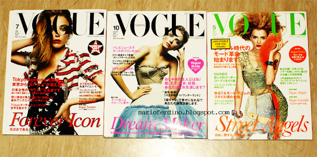
Here are my favorite issues
August 2008 with Raquel Zimmermann wearing Chanel
October 2008 with Lily Donaldson wearing Dolce&Gabbana
May 2010 with Lily Donaldson wearing Louis Vuitton

Continue after the JUMP!


magazine haul: September 22, 2010

So yesterday my friends and I took a trip down to Orchard for a well-needed quality time together. I decided I needed to stock up on magazines for I haven't bought a single one in weeks! Been too lazy to get myself to travel all the way down town as well as being broke. But anyway, went down to the Kinokuniya at Ngee Ann City and got these:
Didn't find much, I was mostly looking forward to buying the September issue of Vogue China, but to my shock they said they're out and might restock at the end of the month. OH GOD THEY BETTER. But anyway, bought 6 magazines.


Wednesday, September 22, 2010

Vogue Nippon November 2010: Lily Donaldson by Inez and Vinoodh

It may still be September, but Vogue Nippon has already released their November issue, one month in advance as usual. I actually still don't understand why they release their magazines a month earlier, but I'm not complaining about it. Cover model Lily Donaldson is seen here wearing yet another Miu Miu look from their Fall/Winter 2010 collection. This is in fact Lily's 2nd Vogue Nippon cover this year, the first one being in May (my favorite Nippon cover). The color scheme is overall quite coherent, The black and orange texts as well as the earrings all adhere to the harmony of the cover. It's interesting to note that as compared to the other Nippon covers this year, this one is shot only from the waist up. I must say though, I quite miss the old headline font they use to have up until their August 2010 issue. But it's not too bad, maybe I need some time to get use to it.... 
However, I can't say I'm too thrilled with the outfit choice, but I absolutely adore this Miu Miu collection and say that at least they didn't go with the obvious choice dress used in British (Freja, August), Australian (Codie Young, October) editions of Vogue, Elle UK (Lily Allen, August) and W (Eva Mendes, August). They in fact went with one of the more simple designs from the collection.
I will do a review on this as soon as I get my copy.


Click to see the dress as well as a comparison!